Recently I had the need to create a website with a brick like grid effect. To achieve the effect I used jQuery masonry, in fact EpicWebs uses the same piece of JavaScript. To get hold of the plugin head on over to http://masonry.desandro.com/ and download the js file. Then come back here to learn how to get it all set-up.
How to get started with jQuery masonry
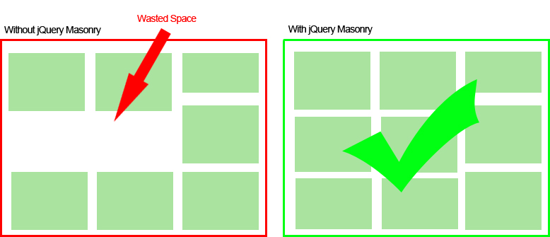
jQuery masonry will allow you to place elements in a brickwork like structure on your site. The benefit is when you use floats they will not tuck under other elements but they will move to the highest element and tuck underneath, creating unwanted space. Take a look at the (awfully drawn) example below.
The majority of the set-up with a masonry grid is to make sure you have the correct html. The following html will create everything you need to get started. All you need to do is fill the grid-item divs with some content. Add as many grid-item divs as required.
<div id="masonry-grid">
    <div class="gutter-sizer"></div>
    <div class="grid-item"></div>
    <div class="grid-item"></div>
    <div class="grid-item"></div>
</div>
After creating the correct html you will need to apply masonry. First thing is to include the masonry script on your page, use the following code and remember to make sure the path to your script is correct. You can use the firebug network tab to check there are no red 404 errors.
<script src="/path/to/masonry.pkgd.min.js"></script>
Now that you have the script on your page you can call masonry on the #masonry-grid element, you can either use JavaScript or jQuery to achieve this.
Javascript Version
// Javascript
var container = document.querySelector('#masonry-grid');
var msnry = new Masonry( container, {
  // options
  columnWidth: 200,
  itemSelector: '.grid-item'
});
jQuery Version
// jQuery
var $container = jQuery('#masonry-grid');
// initialize
$container.masonry({
  columnWidth: 200,
  itemSelector: '.grid-item'
});
Great, now you should see a nice masonry grid layout on your site, if not then check the next section on help with getting masonry perfect. If your issue is not listed below then leave a comment at the end of this article and I’ll try my best to help.
Be careful, these things broke my masonry grid!
The following pieces of CSS/JavaScript changes meant that my grid just stopped working or didn’t quite position correctly.
Custom Fonts
Custom fonts caused my masonry grid to not position perfectly so I used the following piece of code to rectify it, this only works with Google fonts or other custom fonts that use the font loader (for example typekit). This is what I had to use on EpicWebs.
    WebFont.load({
        google: {
            families: ["Open Sans", "Ranchers"]
        },
        active: function () {
            var e = jQuery("#masonry-grid");
            e.masonry("layout");
        }
    });
Setting a right/left margin
This one is a little more erratic, it doesn’t always break my masonry grid but I found it better just to leave it off and use the gutter-size option of jQuery Masonry.
Broken or Incorrect JavaScript
This is fairly obvious, but it’s surprising how many times a missing bracket can cause you to search your whole code for something so simple. I recommend using Firefox with firebug as it allows you to open up a console with f12 and see exactly what is happening when the code runs. You can also use console.log(“some text”); to output a message in certain areas of code. This is helpful for checking if statements and making sure your code is executing properly.
Another thing to be careful of is custom fonts, check out our guide on fixing jQuery masonry if you have custom google fonts.
Filter the masonry grid with jQuery
This can get a little complex but it achieves a great experience for the user. To filter a particular set of grid items I attached a class to each type of grid item and then filtered them using a select box on change. The select box values were the class names that I had set previously to the grid items. After all grid items are hidden and then the grid items with the selected class are shown we call the masonry layout method. Check out the following piece of code to see how it was achieve.
Filtering With Javascript
	// This bit sets up jQuery Masonry
	var $container = jQuery('#masonry-grid');
	$container.masonry({
		itemSelector: '.grid-item'
	});

	// This does the filter by binding an event on the change of a select box
	jQuery("#grid-filter select").on("change", function() {
		group = jQuery(this).val();
		group_class = "." + group;

		if(group != "") {
			jQuery(".grid-item").hide();
			jQuery(group_class).show();
			jQuery('#masonry-grid').masonry('layout');
		} else {
			jQuery(".grid-item").show();
			jQuery('#masonry-grid').masonry('layout');
		}
	});
Example Markup For Filtering
<select id="grid-filter">
    <option value="category-one">Category One</option>
    <option value="category-two">Category One</option>
</select>

<div id="masonry-grid">
    <div class="gutter-sizer"></div>
    <div class="grid-item category-one"></div>
    <div class="grid-item category-two"></div>
    <div class="grid-item category-one"></div>
    <div class="grid-item category-one"></div>
    <div class="grid-item category-two"></div>
</div>
When combined with the jQuery above the markup will hide all categories and then display a category based on the value selected.
Making jQuery Masonry Responsive
One of the things I have done on EpicWebs is make jQuery Masonry responsive, if you resize your browser window on the home page you will notice the boxes will resize and slot down beside each other at every step of resizing the browser window. I have achieved this effect using percentages and media queries. Here is a look at how to achieve it using just CSS and not changing any of the masonry we have used above.
@media (min-width:1500px){
	#masonry-grid .gutter-sizer{width:4%;}
	#masonry-grid .grid-item{width:22%;margin-bottom:4%;}
}

@media (max-width:1200px){
	#masonry-grid .gutter-sizer{width:4%;}
	#masonry-grid .grid-item{width:48%;}
}

@media (max-width:768px){
	#masonry-grid .gutter-sizer{width:0%;}
	#masonry-grid .grid-item{width:100%;}
}
What we are doing above is targeting device widths using a media query. We then change the width of the gutter-sizer depending on how many blocks of masonry we wish to show and change the width of the grid-item. This does take a look work with a calculator to get working perfectly, but once you do it looks awesome and is great for users of tablets, phones and desktops. If you need any help with this then leave a comment below.
jQuery Masonry Grid Examples In The Wild
Now that we have learn about some jQuery masonry, let’s take a look at a few jQuery masonry grid examples in the wild, check them out for some inspiration and see what you can really do with it. It’s a great plugin and I recommend really getting to grips with it before you add it to a production site.
- http://www.polkadotfrog.co.uk/all-vacancies/
- https://epicwebs.co.uk/
- http://hollandandholland.com/guns/
Start Using jQuery Masonry
You can use the jQuery Masonry plugin for loads of great interfaces on your website, from a brick like wall of images or to a nice blog post listing like the front of EpicWebs. Good luck and get coding!
Comments