I really enjoy the process of extracting the details from a client to try and figure out what exactly the goal of them having a website is, sometimes they don’t even know they just thought they needed a website because they didn’t have one. Although I guess you could see it as a goal, wanting a website because you don’t have one… I always like to have a specific goal before I start to wire frame anything. Just a word of warning, i’m not a designer i’m a developer, I don’t do a lot of wire framing but it’s something which interests me in my own projects and I have started to quickly sketch things out for clients. This blog post is about my learning process and what I have done so far, it’s not teaching you how to do it yourself.
I’m going to upload and show you some sketches I have done of wireframes, these have normally be in meetings or just after a meeting when I want to get something across right away before the client forgets.
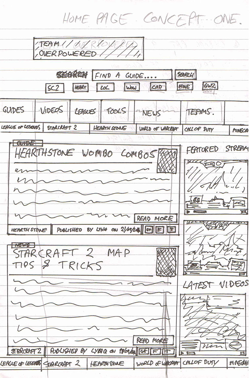
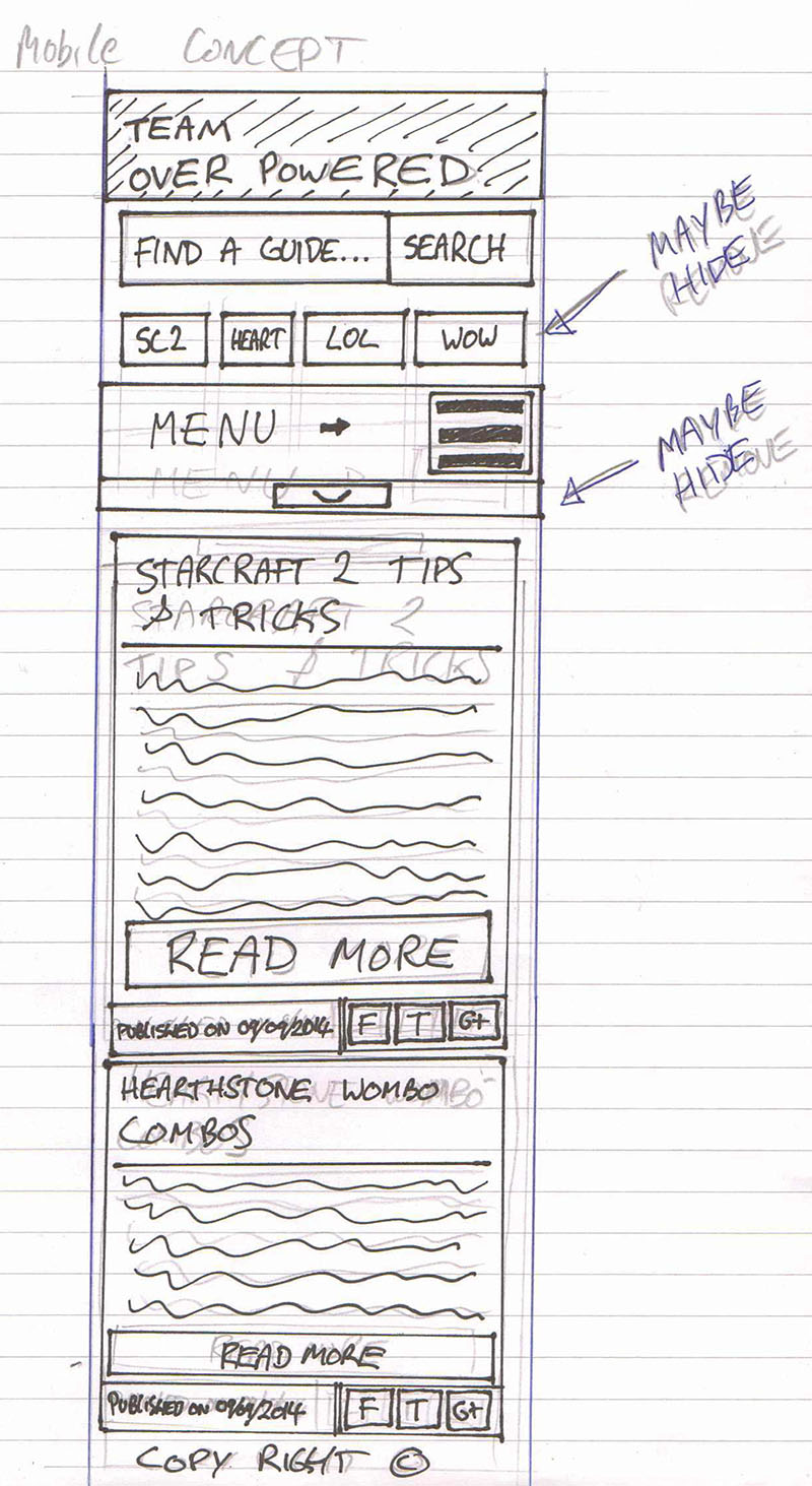
Here is the first wire frame of my own website which I run, although I don’t have much interest in it at the moment, it’s TeamOverpowered.com.
Example One – Team Overpowered
- Website: teamoverpowered.com
- Site Goal: To get users to consume the content, specifically gaming guides.
- Development Type: Re-development.
This example includes a desktop and mobile version of the site. I did slightly change a few things once I went live, but I think it’s looking pretty spot on. The main thing I did when I was sketching this out was to make the guides easier to view and digest, before the revamp of this site the guides were fairly hidden away. To increase the presence of the guides I made the site loop through all the blog posts on the home page and then added a big search guides button at the top right which gets you straight into the guide section from the home page.
Example Two – Little Bit Of Whimsy
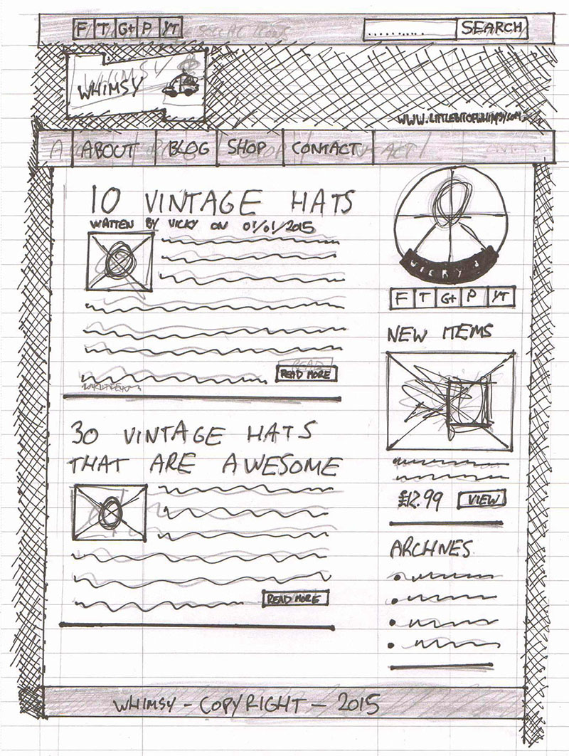
- Website: littlebitofwhimsy.com
- Site Goal: To make it look nice and get visitors to read the blog and comment on blog posts.
- Development Type: Re-development.
This is a vintage blog I have designed over and over again, it’s for my wife and she loves changing her mind, which gives me a great excuse to test my skills building her website. This time around I decided to wire frame and sketch out some ideas so I could rapidly change things until she was happy, luckily she is now happy with how her blog looks and has started to update it with some vintage events and other stuff. One of the big things was the look, it had to appeal to her and her audience, so we decided on the big logo at the top left, which has changed a lot since the wire frame, but I think it’s looking pretty good.
Example Three – Client Website
- Website: Undisclosed
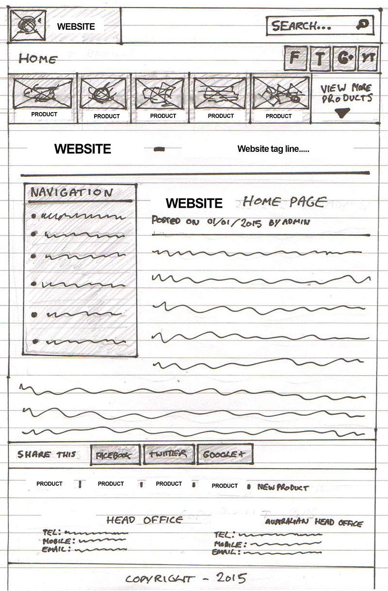
- Site Goal: To allow clients to view information about various products and get in contact.
- Development Type: Development.
I can’t show the URL yet and I have blanked out some of the wire frame so it doesn’t show the product, but I really like this wire frame. The main idea of the site is to act as a portal into sort of mini sites that are wrapped in the primary product, similar to the way big brands like Coca Cola do their website. Another great thing about this wire frame is that the client loves the idea.
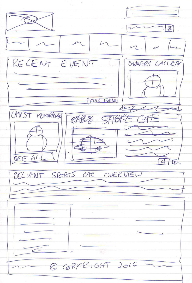
Example Four – Sporting Reliants
- Website: sporting-reliants.com
- Site Goal: Allow visitors to consume the vast amount of content.
- Development Type: Development.
This site is for a friend, the idea behind it is to allow visitors to jump into the section they want quickly and easily. This is the key to this site as it is a non profit website run as a hobby and has a huge amount of content. The idea is that where ever you are on the site, you are only two clicks away from the content that you want. It’s going to be a pretty big build, but I think it’s going to look awesome when it’s finished.
Summary On Wiring Framing
I enjoy doing wire frames as they give the client a good indication of what to expect but also the chance to make changes up front before we head into hours of design.
I’m currently learning the process of wire framing and trying to integrate the goal of the website into the wire frame. If you guys have any comments on my wiring frames and how to improve them that would be greatly appreciated or if if you fancy just saying, good job that’s great too.
Comments